Hubb
ROLE
UI/UX Designer
DURATION
Spring 2026
PROJECT SCOPE
End-to-end UX design for a mood-first mobile app helping users discover third spaces
TOOLS
Figma
OVERVIEW
Third spaces are disappearing. Rising rents have closed community spaces, remote work has blurred the line between home and office, and loneliness has been declared a public health crisis. Yet no digital tool exists to help people find the spaces that remain.
When someone needs somewhere to be, they open Google Maps, search "coffee near me," get overwhelmed by hundreds of identical results with no useful context, and either pick something at random or give up entirely.
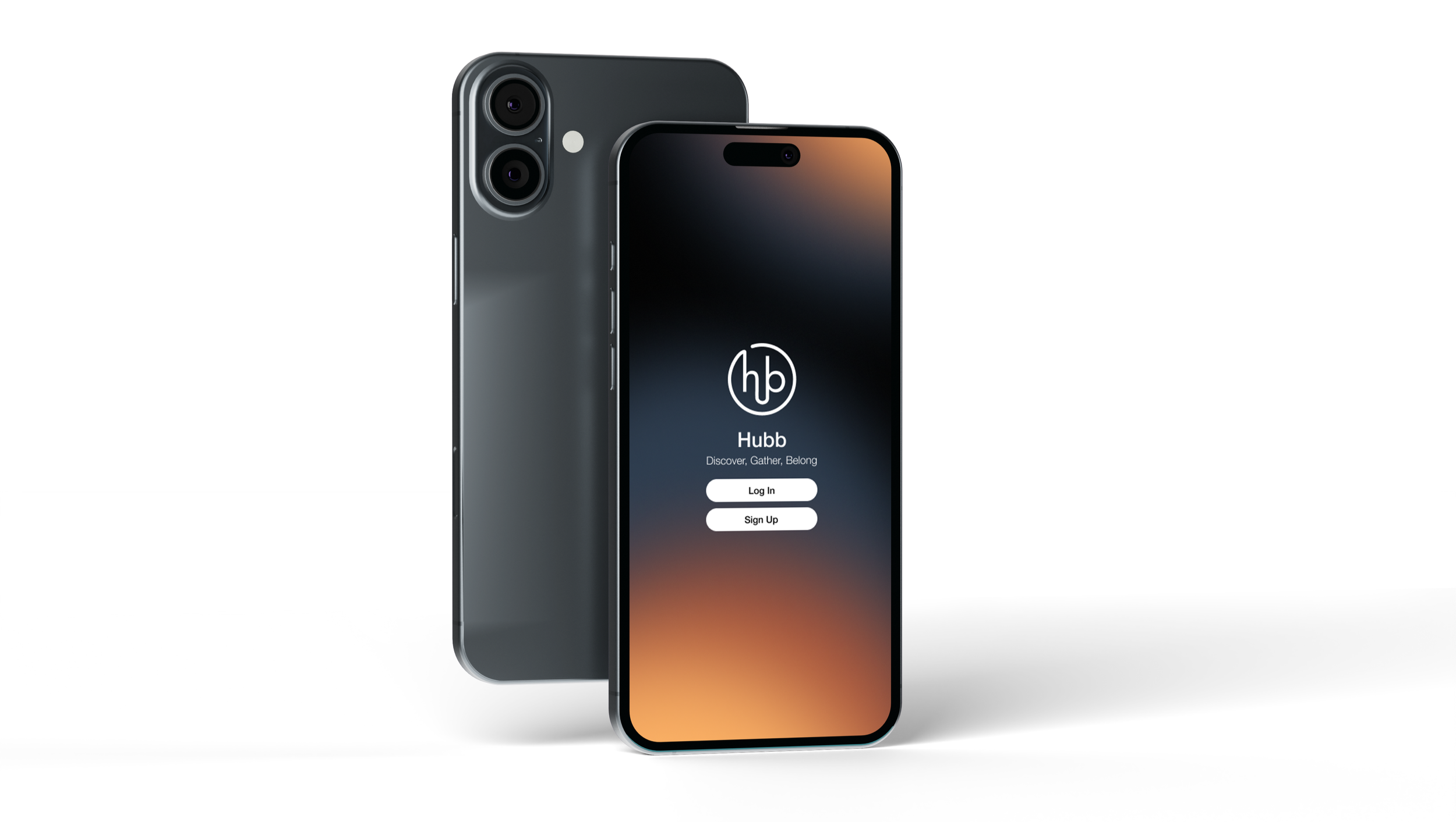
Hubb is a mobile app designed to help people find third spaces — places outside of home and work where you can simply exist without feeling rushed, pressured to buy something, or obligated to interact with anyone. The idea came from a personal frustration: needing somewhere to decompress between responsibilities and realizing no existing app was built for that. Hubb fills that gap by letting people search based on how they want to feel, not just where they want to go.
OBJECTIVES
The core design challenge was reframing how a location app communicates value. Hubb needed to answer a different question than Google Maps or Yelp — not "what can I do here" but "will I feel okay here." The objectives guiding the design were:
Mood-first discovery — allow users to filter spaces by how they want to feel, not just proximity or category.
Reduce friction in decision-making — surface the right information quickly so users can commit to a destination with confidence.
Build trust through community — give the app a human dimension through peer reviews focused on atmosphere, vibe, and social comfort rather than star ratings.
Keep interaction low-pressure — the app itself should feel as calm and unhurried as the spaces it recommends.
DELIVERABLES
The app was designed across five core screens, each serving a distinct role in the user journey from discovery to community participation:
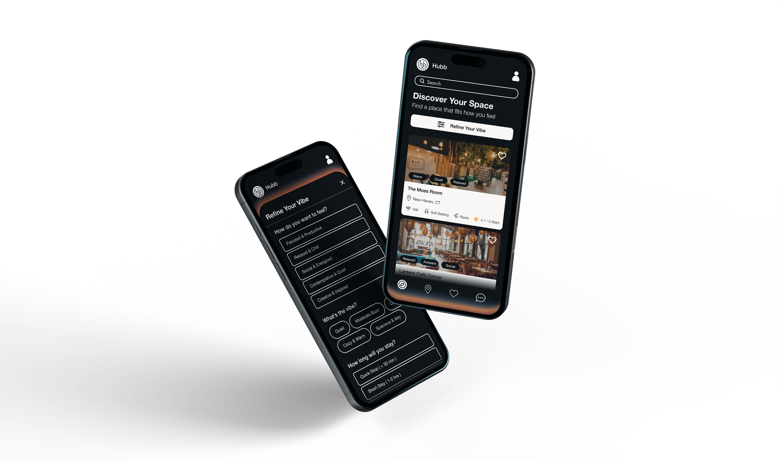
Home & Search — a clean search interface with a "Refine Your Vibe" filter allowing users to specify mood, energy level (quiet/moderate buzz/lively), and planned duration. This replaced the conventional category-based search with an emotionally-driven one.
Map View — a proximity-based map interface showing nearby third spaces as pins, providing spatial context for users who are already out and looking for somewhere to land.
Saved Spaces — a personal favorites page where users can bookmark places and return to them, building a curated repertoire of trusted spots.
Community Reviews — a feed of peer-contributed reviews focused on atmosphere and social conditions rather than product quality, surfacing what it actually feels like to spend time in a space.
Review Submission — a structured but lightweight form allowing users to share their own experience, including which vibes they observed, a written reflection, and a rating.
OUTCOME
Hubb came together as a cohesive five-screen prototype with a warm, minimal design language that reflects the feeling of the spaces it helps people find. The "Refine Your Vibe" filter is the app's defining feature — no existing location tool lets you search by mood or intended duration, and that shift reframes the entire discovery experience. The community review structure does the same for social proof, replacing star ratings with the atmospheric context that actually helps someone decide whether they'll feel comfortable walking through the door.
-

DEFINE
Users needed a way to
find spaces based on atmosphere and comfort, not just location or ratings. -

IDEATE
Explored mood-based filtering as the primary search mechanism instead of category or proximity.
-

PROTOTYPE
Built five screens in Figma covering the full user journey from search to community reviews.
-

TEST
Adjusted layouts and filter structure to keep the experience simple and low-pressure throughout.
Research
INTERVIEWS
To ground the design in real behavior, I conducted interviews with three participants — students and young adults navigating the daily challenge of finding a place to land.
Their experiences varied widely — one rarely left campus, one visited two or three spots a day, one wanted to explore but consistently got overwhelmed and turned back. But all three pointed to the same gap: existing apps describe what a place offers, not what it feels like to be there.
The signals that came up consistently across every interview were:
Noise level
How crowded it gets
Whether solo visitors are common
Seating availability
Whether you're expected to keep buying something to stay
None of these are surfaced by any existing app.
From Concept to Creation
App Design
The app was designed across five screens, each addressing a specific moment in the user journey.
Home & Search
The core of the app. A "Refine Your Vibe" filter walks users through three prompts: how do you want to feel, what energy level are you looking for, and how long do you plan to stay. Results are matched to those inputs rather than just sorted by distance.
Map View
For spontaneous decisions. Nearby spaces appear as pins on a simple map, with a quick preview of comfort signals available on tap.
Saved Spaces
A personal favorites page where users bookmark places they've liked and return to them easily without searching again.
Community Reviews
A peer review feed structured around atmosphere: vibe tags like Quiet, Cozy, Focused, or Social, written reflections, and ratings focused on the experience of being in the space rather than what it sells.
Review Submission
A short, guided form for contributing a review. Users select observed vibes, write their thoughts, and submit a rating. Participation is always optional.
Reflection
This project reinforced that good design sometimes just means asking a better question. Changing the search from "where do you want to go?" to "how do you want to feel?" reframed everything — what the app returned, who it served, and what made it different. It also pushed me to design for multiple types of users at once, from someone who gets overwhelmed easily to someone hopping between spots all day, without letting any one of them dominate the experience. More than anything, Hubb reminded me that the best tool for an emotional need is usually the quietest one.