Cuisinart Package Design
Cordless Electric Kettle
®️ Cuisinart is a registered trademark of Conair LLC
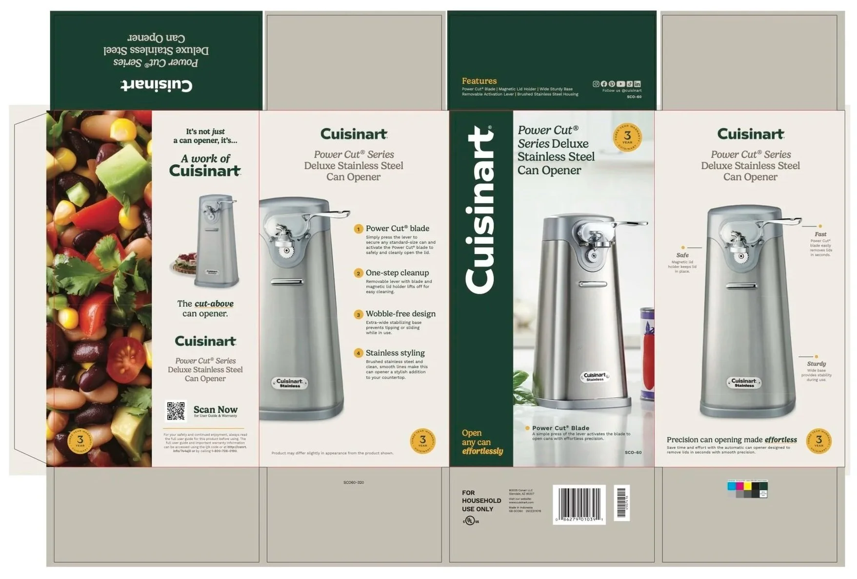
Power Cut Series®️ Deluxe
Stainless Steel Can Opener
®️ Cuisinart is a registered trademark of Conair LLC
ROLE
Graphic Design Intern
DURATION
June - August 2025
PROJECT SCOPE
Packaging Redesign
TOOLS
Adobe InDesign
OVERVIEW
During my summer internship with the Creative Team at Cuisinart in Stamford, I worked closely with the Director of Creative, Diego Da Lan, and Senior Art Director, Michael Patrone, on retail packaging for consumer products. This project marked my first hands-on experience with packaging design and working within a large, established brand system.
My primary responsibility was redesigning existing product packaging that featured Cuisinart’s old branding and transitioning it into the company’s newly established 2024 brand identity. This included applying updated typography, logo usage, and color palettes while maintaining consistency across all panels of the box.
OBJECTIVES
The objective of this project was to successfully convert legacy packaging into Cuisinart’s new brand system while meeting production standards and retail requirements. The final designs needed to feel cohesive, modern, and aligned with the brand guidelines, while clearly communicating product information to consumers.
DELIVERABLES
This project involved the complete retail packaging redesign for the Cordless Electric Kettle and the Power Cut Series Deluxe Stainless Steel Can Opener. My primary deliverables included the development of print-ready box layouts constructed within technical dielines, with all final packaging files meticulously aligned to Cuisinart’s 2024 brand identity and production guidelines.
OUTCOME
Both packaging designs were approved by the Creative Team and prepared for production. The Cordless Electric Kettle and Power Cut Series Deluxe Stainless Steel Can Opener packages were scheduled to be released on retail shelves in Fall 2025, contributing directly to Cuisinart’s ongoing brand refresh across its product line.
-

DEFINE
Identify how existing packaging needed to evolve to match the new brand identity.
-

IDEATE
Explore layout options that balanced branding, product imagery, and required copy.
-

PROTOTYPE
Build full packaging layouts within the dieline using InDesign.
-

TEST
Review designs with creative leadership, apply feedback, and revise until approved.
From Concept to Creation
BRAND IMMERSION
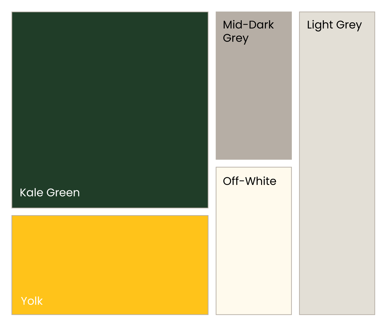
I began the process with a deep dive into Cuisinart’s 2024 brand guidelines, meticulously reviewing the updated specifications for typography, logo spacing, and color palettes. This immersion was critical for understanding the packaging-specific standards for hierarchy and messaging. Mastery of these constraints was essential from day one, as retail packaging requires absolute precision and brand consistency across every physical panel.


LEARNING THE DIELINE
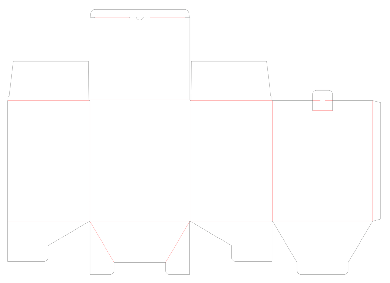
Navigating the complexities of a packaging dieline for the first time required me to pivot from traditional single-page design to thinking in 3D dimensions. I learned to manage design elements across various panels while strictly adhering to technical bleed and fold requirements. This process demanded careful planning to ensure that as the box was assembled, the visual hierarchy remained intact and the flow of information felt seamless for the consumer.
What is a dieline?
A dieline is a flat template that shows exactly where a package will be cut, folded, and printed.
Think of it like a blueprint for a box or label—it tells manufacturers how to turn a flat piece of material into the final 3D package.
DESIGN EXECUTION
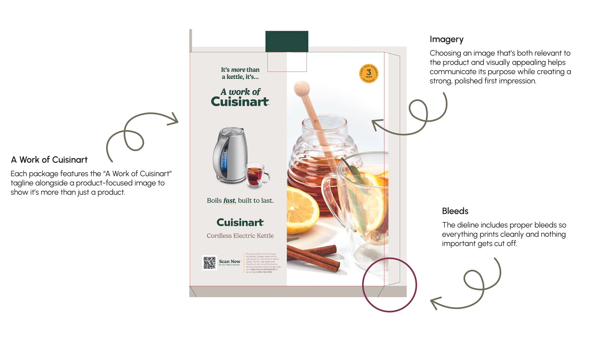
Using Adobe InDesign, I constructed the packaging layouts from the ground up, integrating supplied copy and product imagery into the 2024 brand system. A primary focus of my role was ensuring that both the Kettle and the Can Opener followed a unified visual language, utilizing consistent grid structures and element placement to make them feel like part of the same product family. Through iterative feedback from the Director of Creative and Senior Art Director, I established a clear visual hierarchy that maintained brand harmony and legibility across all panels of the box.
Reflection
This project was a turning point in my development as a graphic designer. Designing real-world packaging taught me how important organization, precision, and adaptability are when working within strict brand systems and production constraints.
Working under an incredibly talented Creative Director and Senior Art Director exposed me to professional workflows, design efficiencies, and countless tips for organizing files and thinking strategically about layout. Their mentorship, along with collaboration from senior designers, pushed me to work more thoughtfully and confidently.
Most importantly, this experience sparked a genuine interest in packaging design. Seeing my work move from concept to approved production, and knowing it would appear on shelves, was both rewarding and motivating. This project strengthened my technical skills, sharpened my attention to detail, and helped shape me into a more disciplined and intentional graphic designer.