A+ Page Content
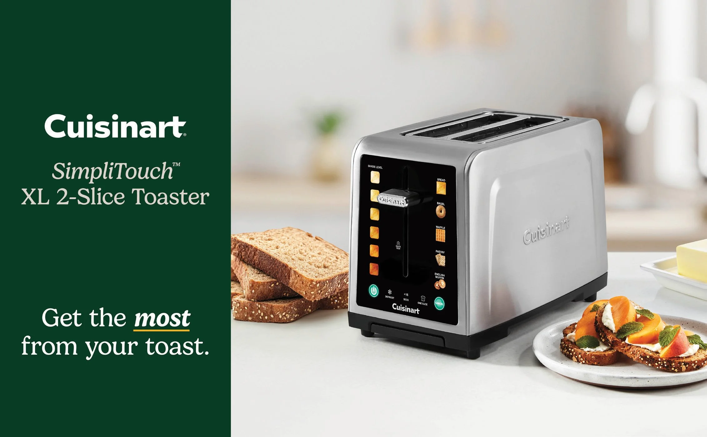
SimpliTouch XL 2-Slice Toaster
®️ Cuisinart is a registered trademark of Conair LLC
Compact Automatic Bread Maker

®️ Cuisinart is a registered trademark of Conair LLC
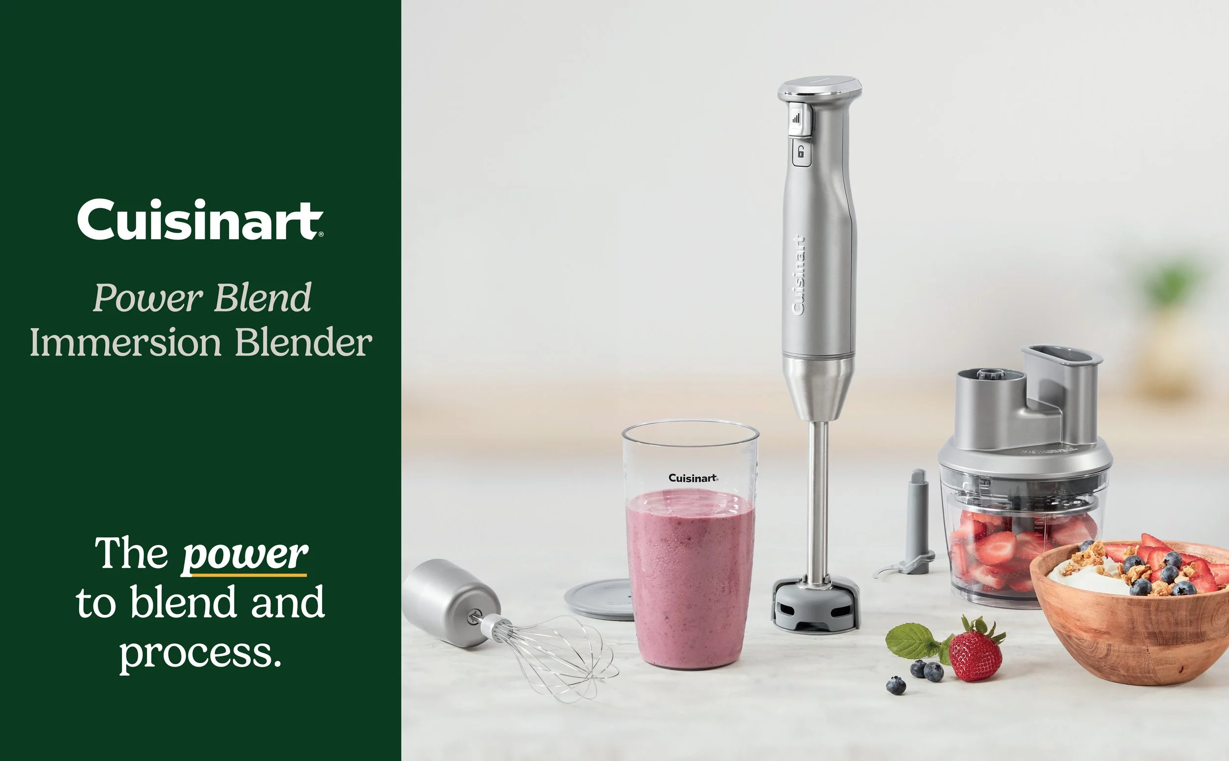
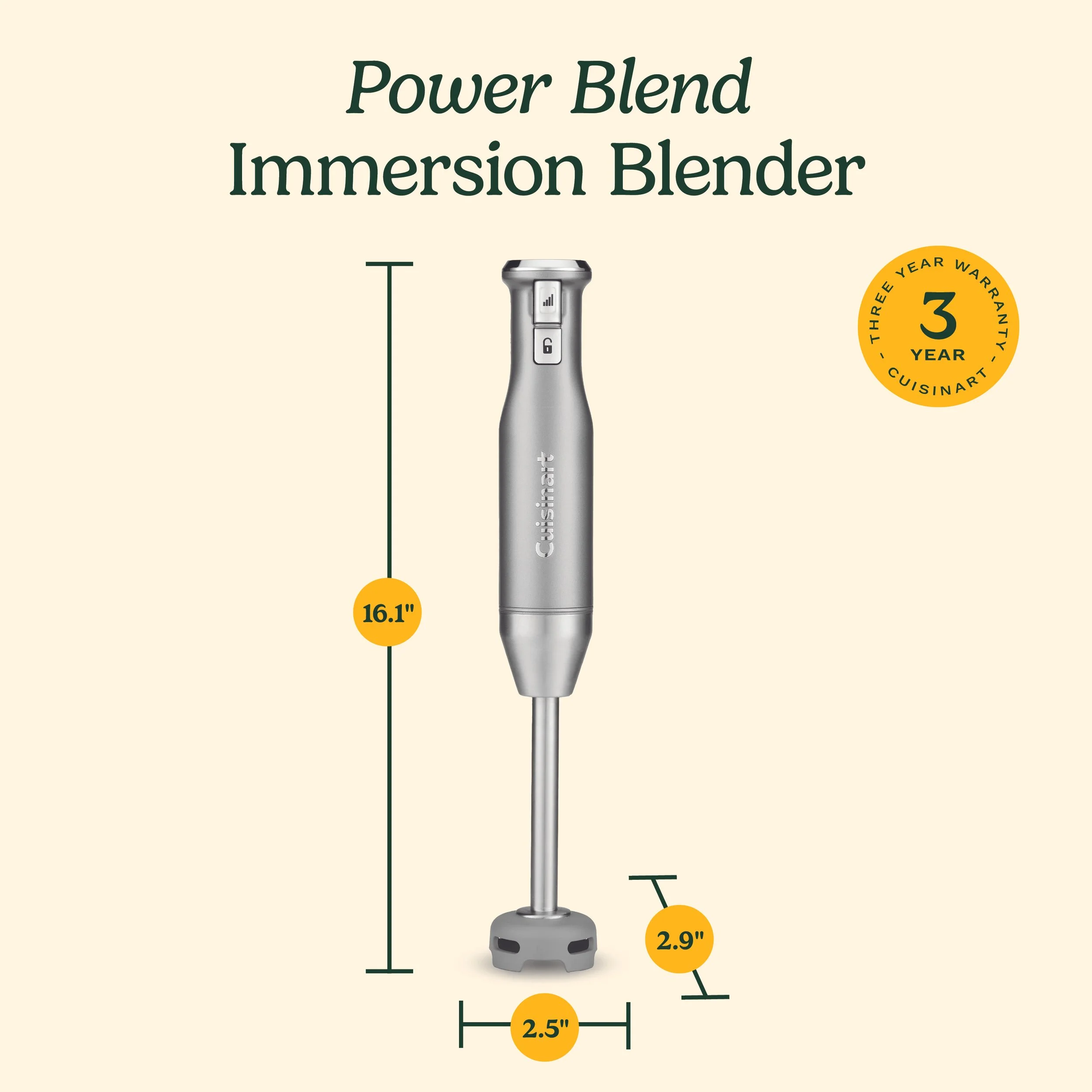
Power Blend Immersion Blender
®️ Cuisinart is a registered trademark of Conair LLC
Brew Central Plus 14-Cup Programmable Coffee Maker

®️ Cuisinart is a registered trademark of Conair LLC
ROLE
Graphic Design Intern
DURATION
June - August 2025
PROJECT SCOPE
Designing A+ content graphics for Cuisinart product listings on Costco’s online storefront
TOOLS
Adobe InDesign
OVERVIEW
As part of my internship with the Creative Team at Cuisinart, I contributed to the development of A+ content used on the Costco product pages. These graphics were designed to enhance the online shopping experience by visually highlighting key product features and helping customers better understand the benefits of each appliance.
The A+ content system combines strong product photography with clear, engaging graphics that communicate features in a quick and digestible way. My role was to design visual assets that aligned with both Cuisinart’s branding and Costco’s strict formatting and accessibility requirements.
OBJECTIVES
The goal of this project was to create visually compelling graphics that clearly communicate product features while staying aligned with Costco’s technical and formatting standards. I focused on presenting key benefits in a way that is both efficient and easy to understand, ensuring shoppers can quickly grasp each product’s value. At the same time, I maintained consistency with Cuisinart’s brand identity across all visuals, balancing clean design with recognizable styling. To support discoverability, I also incorporated searchable text and relevant keywords, making each graphic not only visually engaging but also optimized for improved product visibility online.
DELIVERABLES
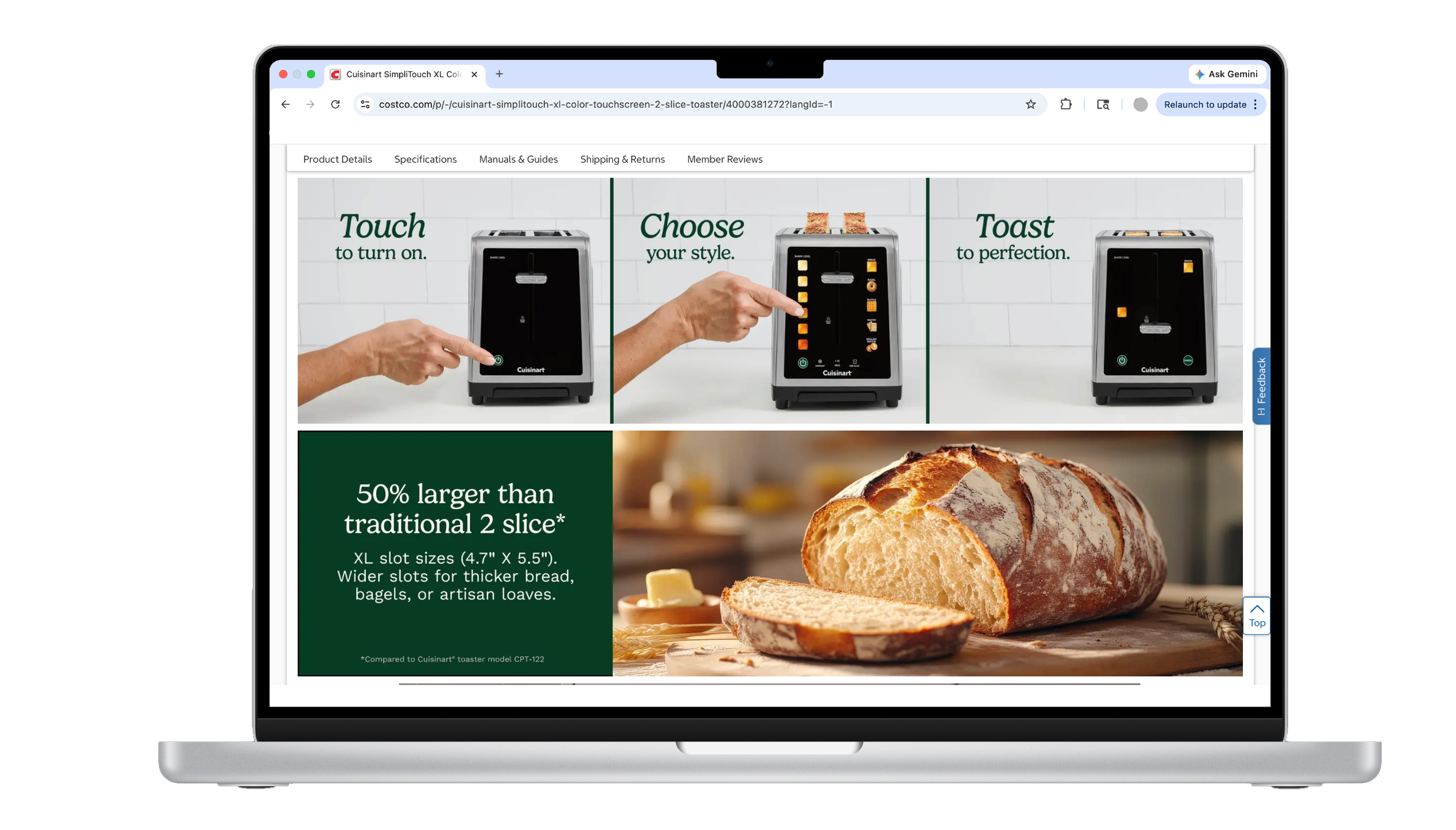
For this project, I designed A+ content graphics across four product pages—SimpliTouch XL 2-Slice Toaster, PowerBlend Immersion Blender, Compact Automatic Bread Maker, and Brew Central Plus 14-Cup Programmable Coffee Maker—with a focus on creating a cohesive and engaging visual story for each product. I developed large banner graphics to communicate key features at a glance, supported by detailed feature callouts that highlight real user benefits and functionality. Throughout the process, I balanced brand consistency with clarity and usability, ensuring every asset was optimized to meet Costco’s formatting and accessibility standards. The final result is a set of polished, conversion-focused visuals that enhance the online shopping experience while clearly communicating each product’s value.
OUTCOME
The completed A+ graphics were approved by the Creative Team and implemented on the Costco Cuisinart product pages. These visuals helped support product marketing by providing customers with clear, engaging feature highlights that improved readability and visual appeal within the online shopping environment.
-

DEFINE
Identify the most important product features that would influence a customer’s purchasing decision.
-

IDEATE
Explore ways to
visually represent product functionality in a clear and engaging format using imagery, iconography,
and layout. -

PROTOTYPE
Create layout drafts in accordance with Costco’s required graphic sizes and module formats.
-

TEST
Review designs with senior designers to ensure clarity, brand alignment, and effective communication. Environment, readability, hierarchy, and visual simplicity were especially important.
Getting Started
UNDERSTANDING PLATFORM REQUIREMENTS
Before beginning design work, I familiarized myself with Costco’s A+ content guidelines, which outlined strict requirements for:
Image dimensions and layout formats
Text limitations for smaller graphics
Searchable text for accessibility and SEO
Clear feature messaging
These restrictions meant every graphic had to be carefully planned to balance visual storytelling with technical constraints.

CONTENT ORGANIZATION
Each product included multiple graphics designed to guide the customer through the product’s key benefits.
The assets were structured around two main formats:
HERO BANNERS
Featured bold product photography
Included concise messaging describing major product benefits
Designed to capture attention while communicating the product’s core value

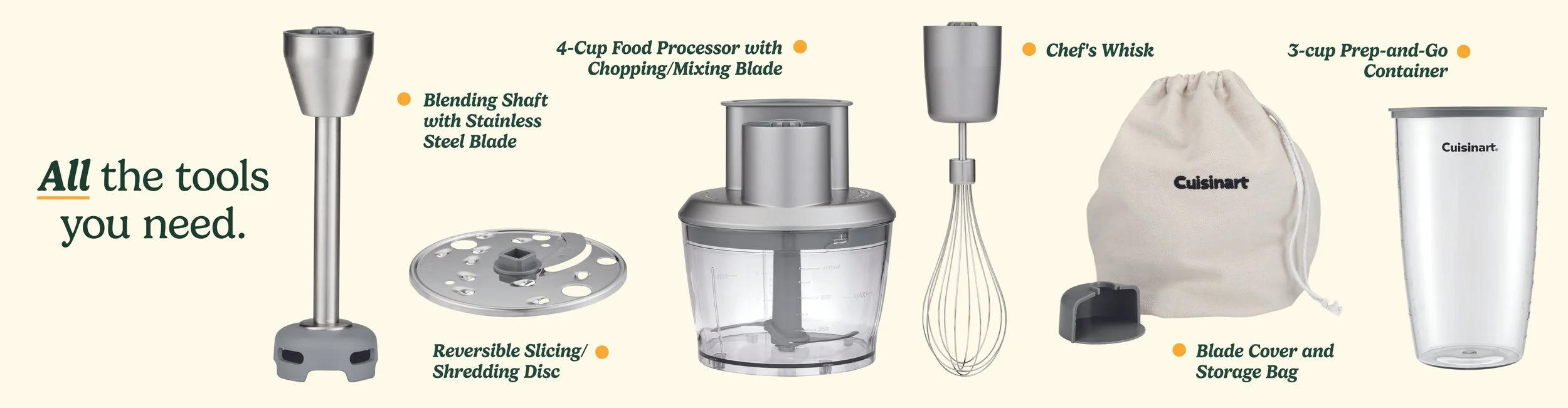
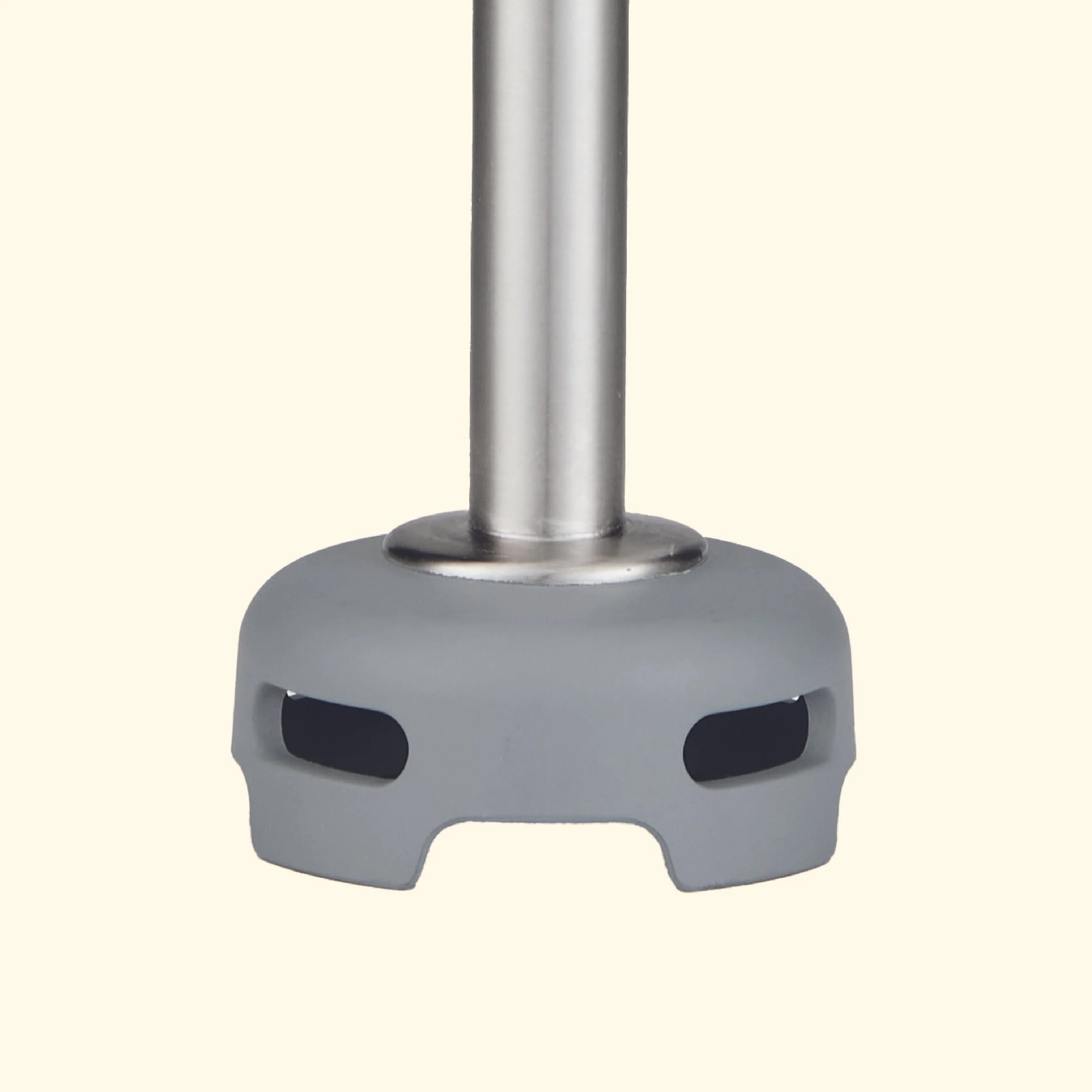
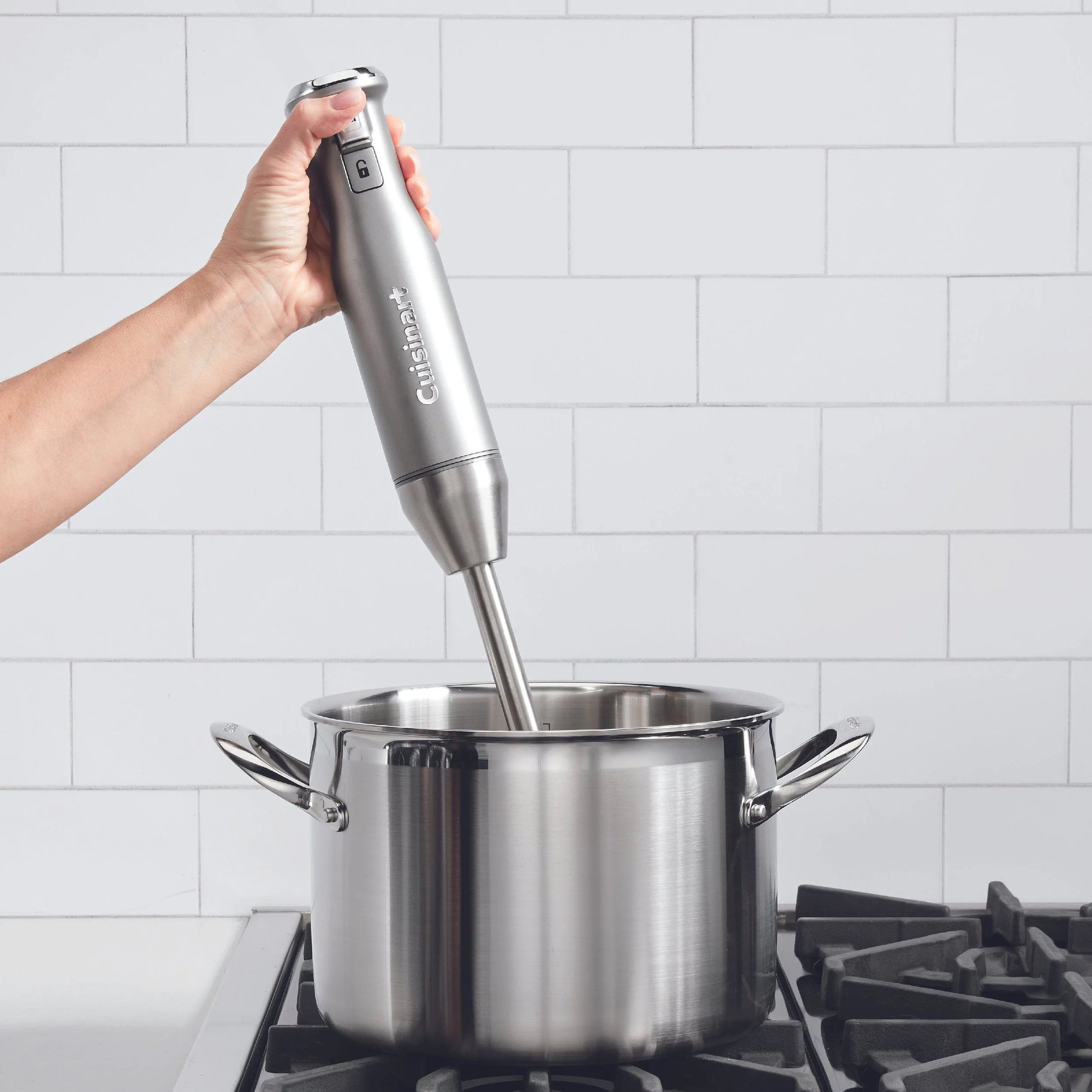
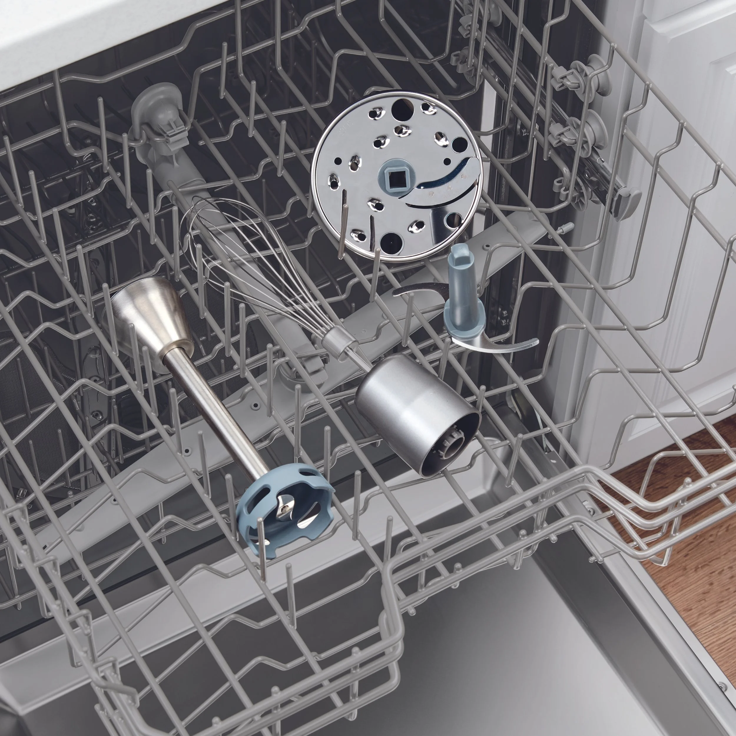
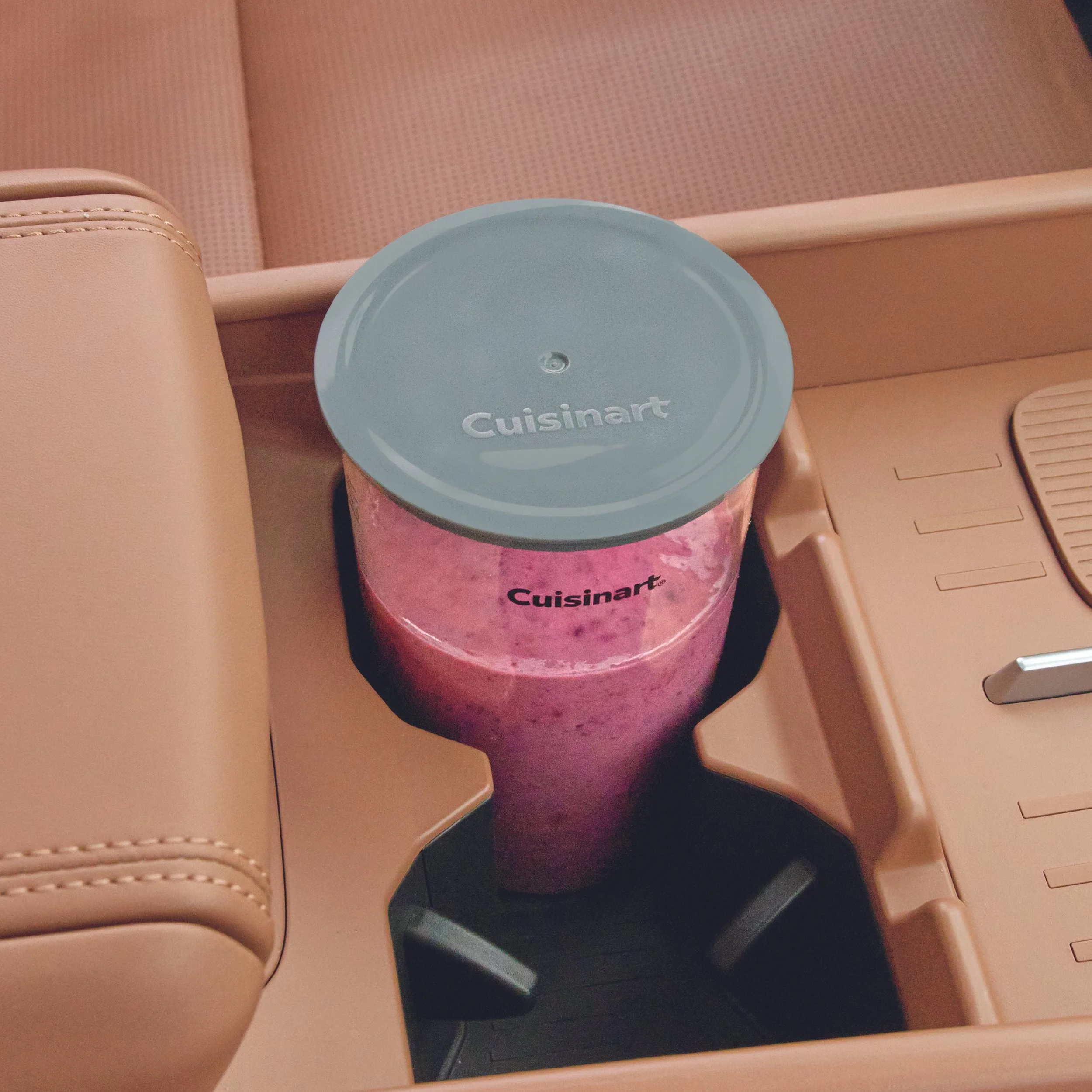
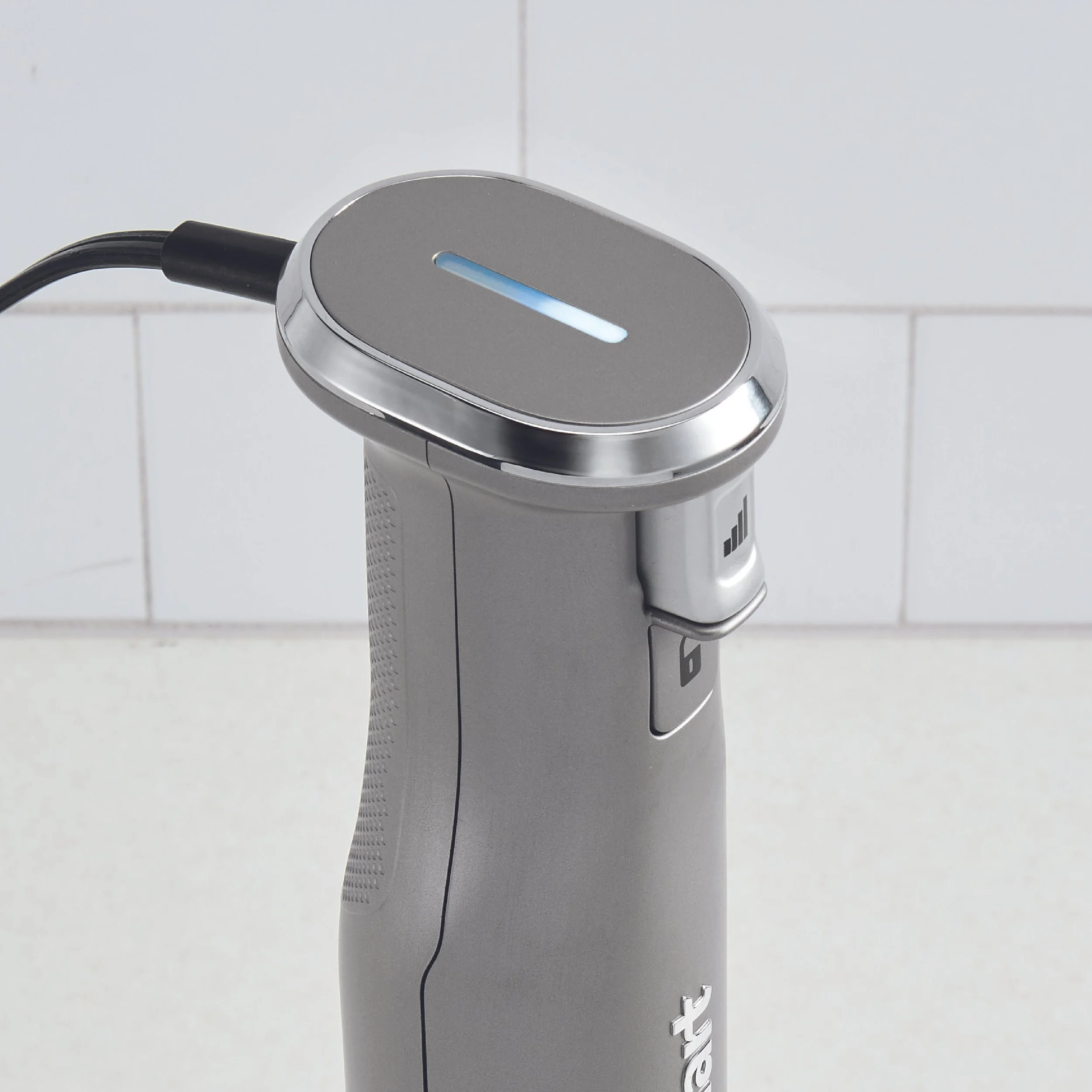
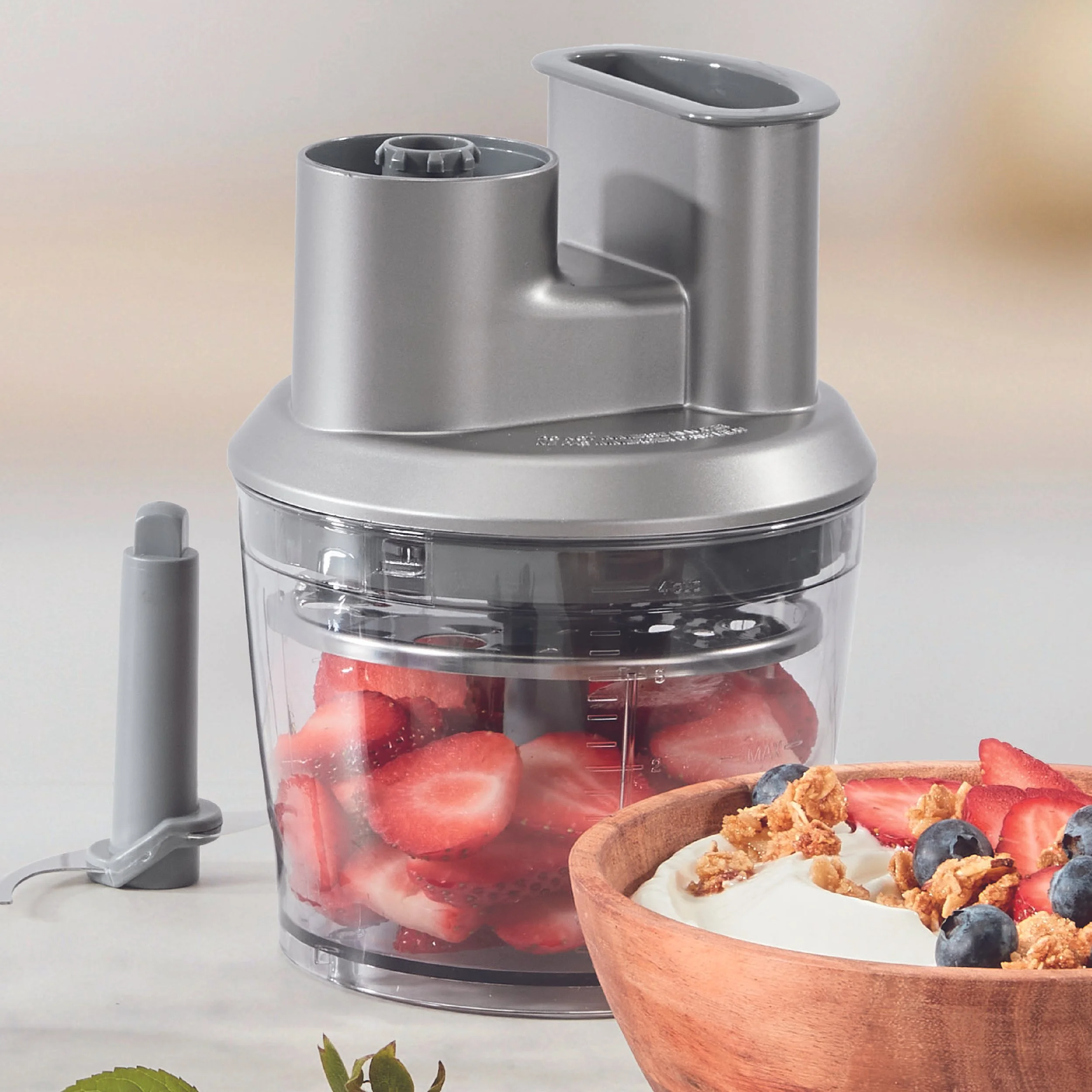
FEATURE GRAPHICS
Focused primarily on visuals
Included minimal or no text with searchable text underneath
Highlighted specific product features such as controls, attachments, or functionality

Reflection
This project introduced me to the intersection of graphic design, marketing, and e-commerce. Unlike traditional print design, these graphics needed to function within a digital shopping environment where customers quickly scan information before making purchasing decisions.
Designing A+ content taught me how to communicate product features efficiently while maintaining visual impact. I learned how to simplify complex product information into digestible graphics and how to design within strict platform requirements without sacrificing creativity.
Working alongside experienced designers also helped me develop a stronger understanding of visual hierarchy and product-focused storytelling. This experience strengthened my ability to think strategically about design—not just how something looks, but how effectively it communicates within a real-world context.