The Agency at QU
ROLE
Creative Director
DURATION
Spring 2026
PROJECT SCOPE
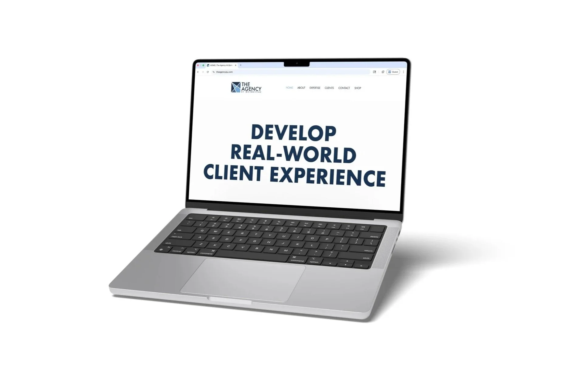
Updating and refining The Agency’s website to better reflect current team members, showcase services, and improve overall user experience without a full redesign.
TOOLS
Wix
OVERVIEW
As Creative Director at The Agency at Quinnipiac, I oversaw multiple client and internal projects, with one of the most impactful being the revamp of the agency’s website. Rather than rebuilding the site from scratch, our goal was to strategically update existing content—enhancing visuals, refining copy, and improving layout structures to better represent the current agency and its capabilities.
I collaborated closely with account executives and design leadership to ensure the website reflected both our evolving team and the breadth of services we offer, including social media, branding, content creation, and strategy.
OBJECTIVES
The primary goal of this project was to modernize the website while maintaining its existing framework.
Key objectives included:
Refresh visual content to reflect the current agency team
Improve layout and hierarchy for better usability
Highlight leadership roles and strategic capabilities
Create a more engaging and personalized experience for visitors
Ensure each student member was clearly represented and memorable
DELIVERABLES
Updated homepage, about page, and expertise pages
Redesigned team layout with improved hierarchy
Interactive popup profiles for each student
New “Strategy” section highlighting leadership roles
Integration of motion elements (live photo clips)
Refreshed imagery and rewritten copy across key pages
OUTCOME
The updated website more accurately represents the agency’s current team, structure, and capabilities. The improvements enhanced both usability and visual engagement, creating a more dynamic and professional online presence.
By prioritizing both strategy and storytelling, the site now better serves potential clients, employers, and prospective students—offering a clearer understanding of who we are and what we do. The project also strengthened internal alignment across teams and established a more scalable structure for future updates.
-

DEFINE
Identify gaps in the existing website, particularly
in representation, engagement, and clarity of services. -

IDEATE
Collaborate with leadership to explore ways to modernize visuals, improve structure, and better highlight team members.
-

PROTOTYPE
Develop layout updates and interactive elements within Wix, testing new structures for team pages and expertise sections.
-

TEST
Review updates collaboratively, iterating on layout, content, and interactions to ensure clarity, usability, and visual consistency.
Process & Execution
PLANNING & STRATEGY
The project began with a collaborative working session between leadership, including account executives and design leads. Together, we identified key priorities and aligned on a focused approach: enhance rather than overhaul.
We outlined three main areas of improvement:
Updating imagery and copy
Refining the About page experience
Expanding the Expertise page to include strategy
This planning phase ensured all updates were intentional and aligned with both user needs and agency goals.
From Concept to Creation
UPDATING IMAGES & COPY
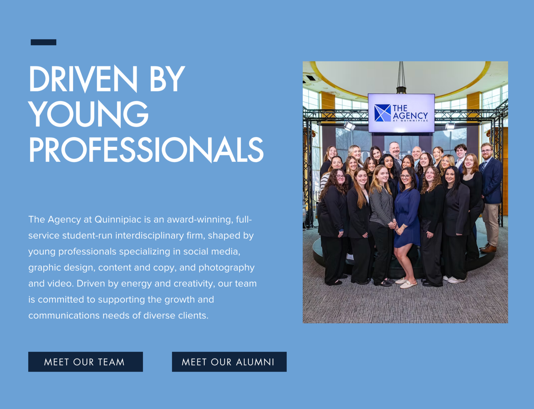
A major priority was ensuring the website accurately reflected the current agency cohort.
Replaced outdated images across the homepage, about page, and expertise pages
Selected visuals that better represented agency culture and professionalism
Updated copy to reflect current services, tone, and positioning
Ensured consistency in voice across all pages
These updates made the site feel more current, cohesive, and aligned with the agency’s brand.
REFINING ABOUT PAGE & STUDENT SPOTLIGHT
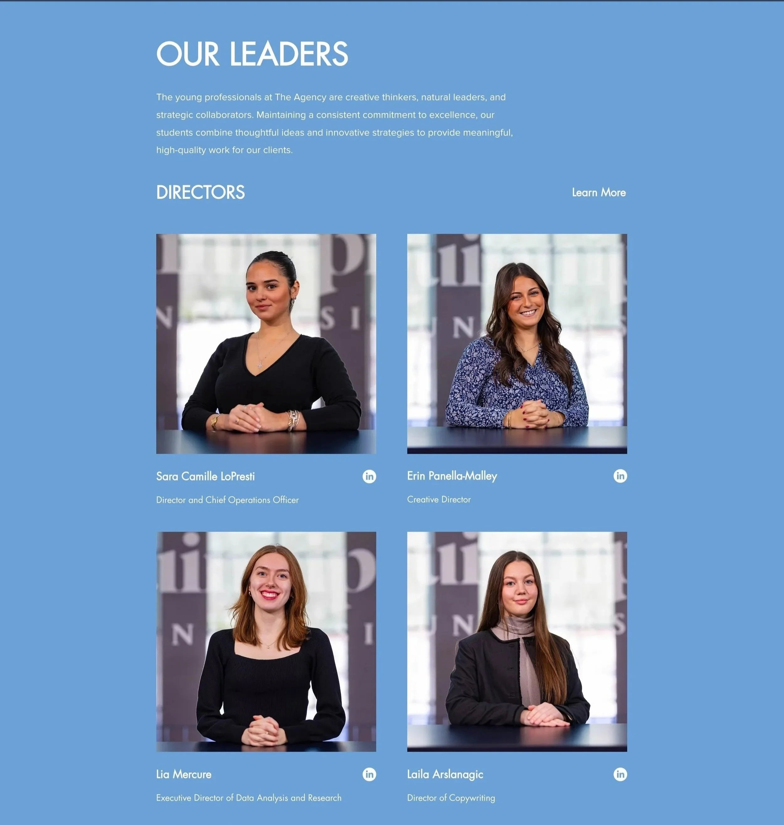
One of the most impactful contributions I made was redesigning the About page to better highlight each individual member.
Reworked layout from a 3-column grid to a 2-column structure for improved readability and emphasis
Organized team members by hierarchy: Directors, Account Executives, and Co-Vice Presidents
Designed and implemented interactive popup profiles for each student
Each popup included:
Name and leadership role
Major/minor
Short personal bio
This feature ensured every student had a dedicated moment of visibility, transforming the page from a simple directory into a more engaging and personal experience.


ADDING STRATEGY SECTION
To better communicate the agency’s full capabilities, we introduced a new Strategy section within the Expertise page.
Highlighted faculty advisors and key leadership roles
Included Creative Director and Director of Data Analysis & Research
Reinforced the agency’s strategic foundation alongside creative execution
LIVE PHOTOS
Additionally, we introduced interactive “live photo” elements:
Hover/slide interactions reveal short video clips of team members
Added personality and motion to an otherwise static experience
Created a more dynamic and memorable user interaction
Reflection
This project pushed me to think beyond execution and step fully into a creative leadership role, balancing strategy, collaboration, and design within an existing system. Rather than starting from scratch, I focused on identifying high-impact opportunities for improvement—refining structure, enhancing storytelling, and elevating how the agency presents itself. Leading this effort strengthened my ability to collaborate across teams, translate broad goals into actionable design decisions, and create solutions that prioritize both user experience and clarity. It also reinforced the importance of iteration, showing that thoughtful, strategic updates can be just as powerful as a complete redesign when done with intention.