Garamond Type Specimen Booklet



ROLE
Typography Designer
DURATION
Fall 2023
PROJECT SCOPE
Designing a multi-page type specimen booklet in Adobe InDesign that explored the history, anatomy, functionality, and visual identity of Garamond through editorial layout, typographic hierarchy, and experimental composition.
TOOLS
Adobe InDesign
OVERVIEW
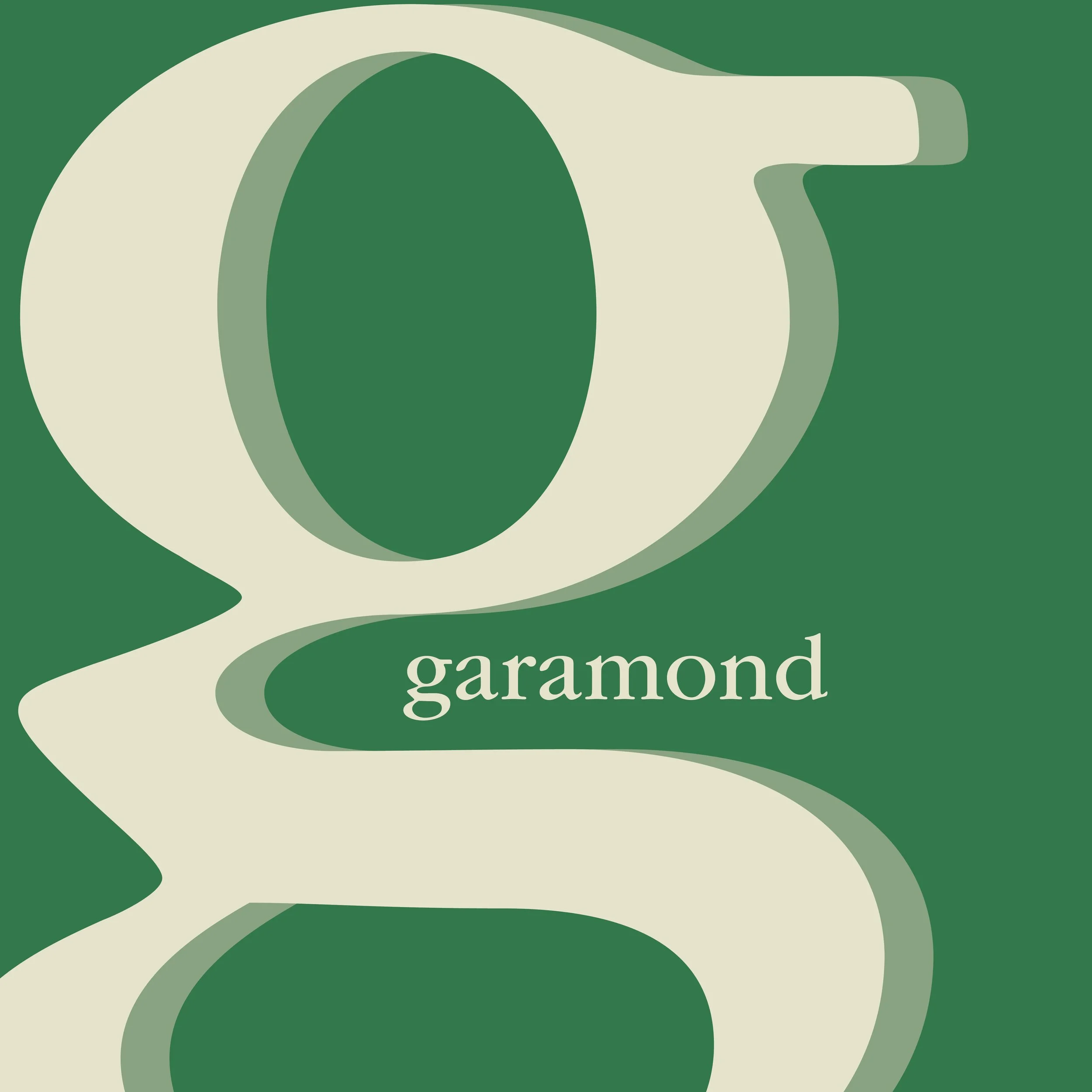
This project involved designing a comprehensive type specimen booklet centered on Garamond, one of the most historically significant serif typefaces. The booklet was created to educate viewers on Garamond’s origins, typographic anatomy, stylistic classifications, and practical applications while visually embodying the sophistication of the typeface itself. Through extensive research, iterative composition studies, and multiple design explorations, I developed a publication that balanced historical content with contemporary editorial design.
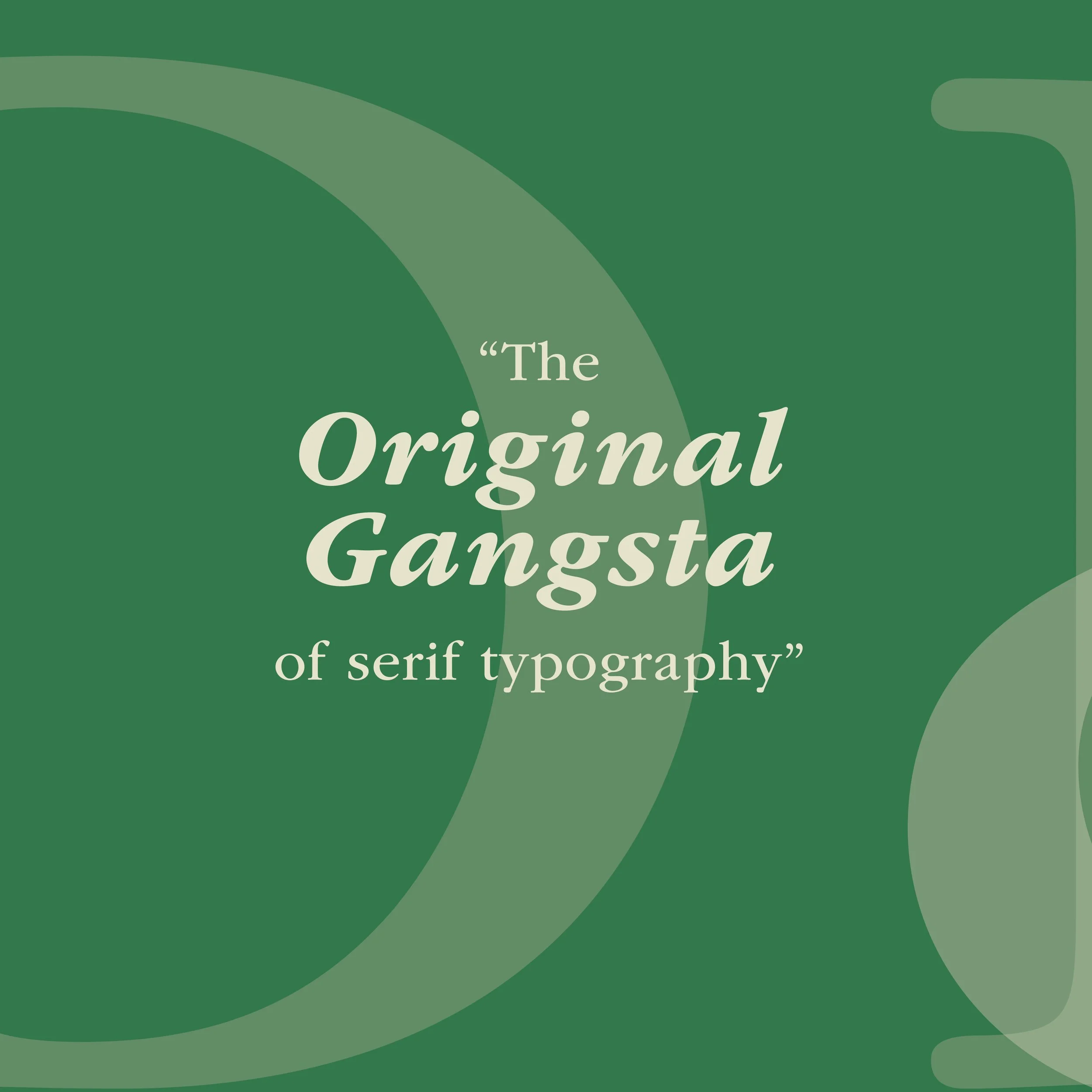
The final booklet transformed Garamond from simply a font into the primary visual language of the project. By using enlarged letterforms as compositional devices, layered transparencies, structured grid systems, and refined color palettes, the design emphasized Garamond’s elegance while showcasing its versatility across informational and expressive layouts. Initial process work included Pinterest-based visual research, grayscale and color comp explorations, and multiple compositional directions before refining the final green-toned system.
OBJECTIVES
The goal of this project was to create a visually engaging editorial piece that communicated both the technical and historical significance of Garamond while reflecting its timeless sophistication through design choices.
Key objectives included:
Presenting Garamond’s historical background and creator, Claude Garamond
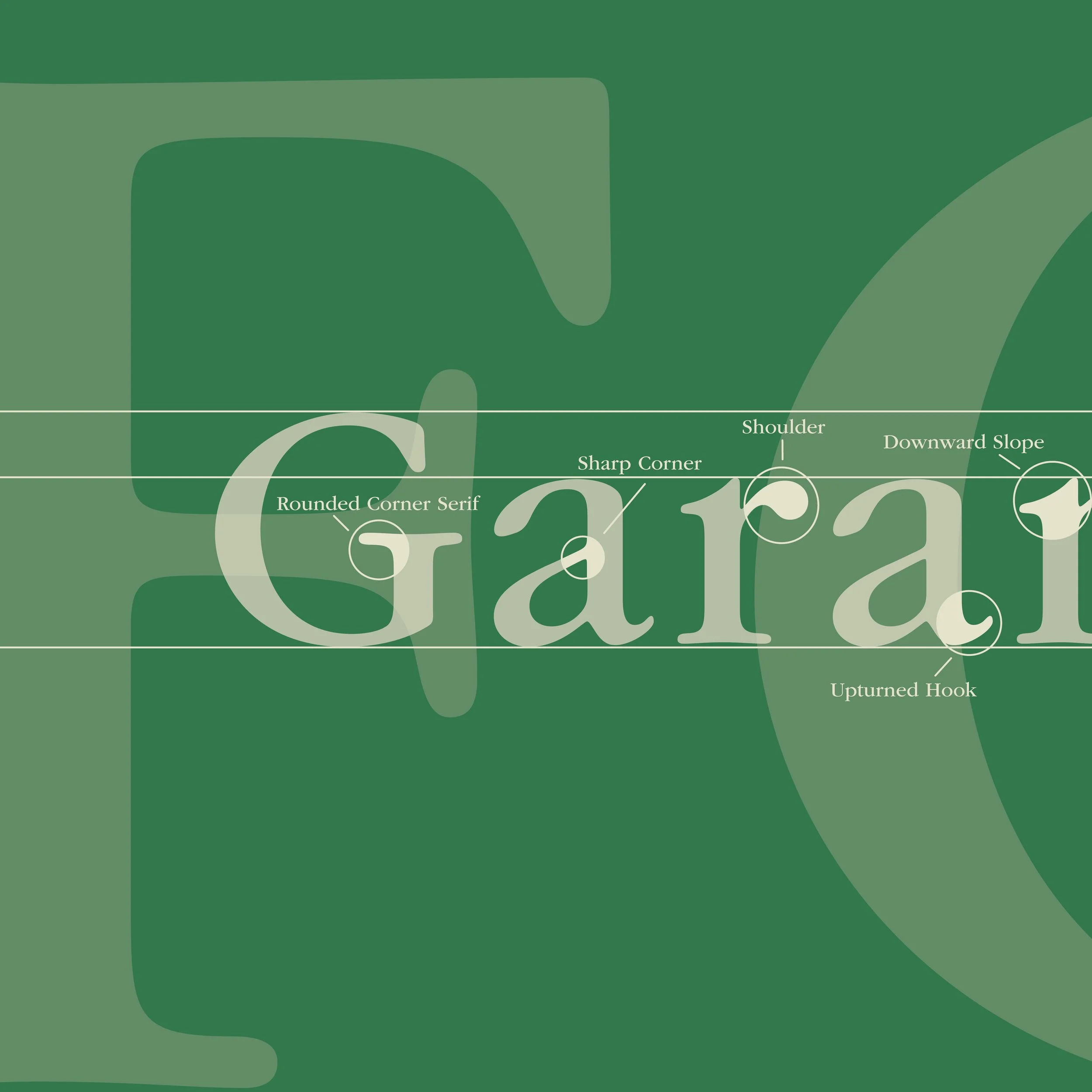
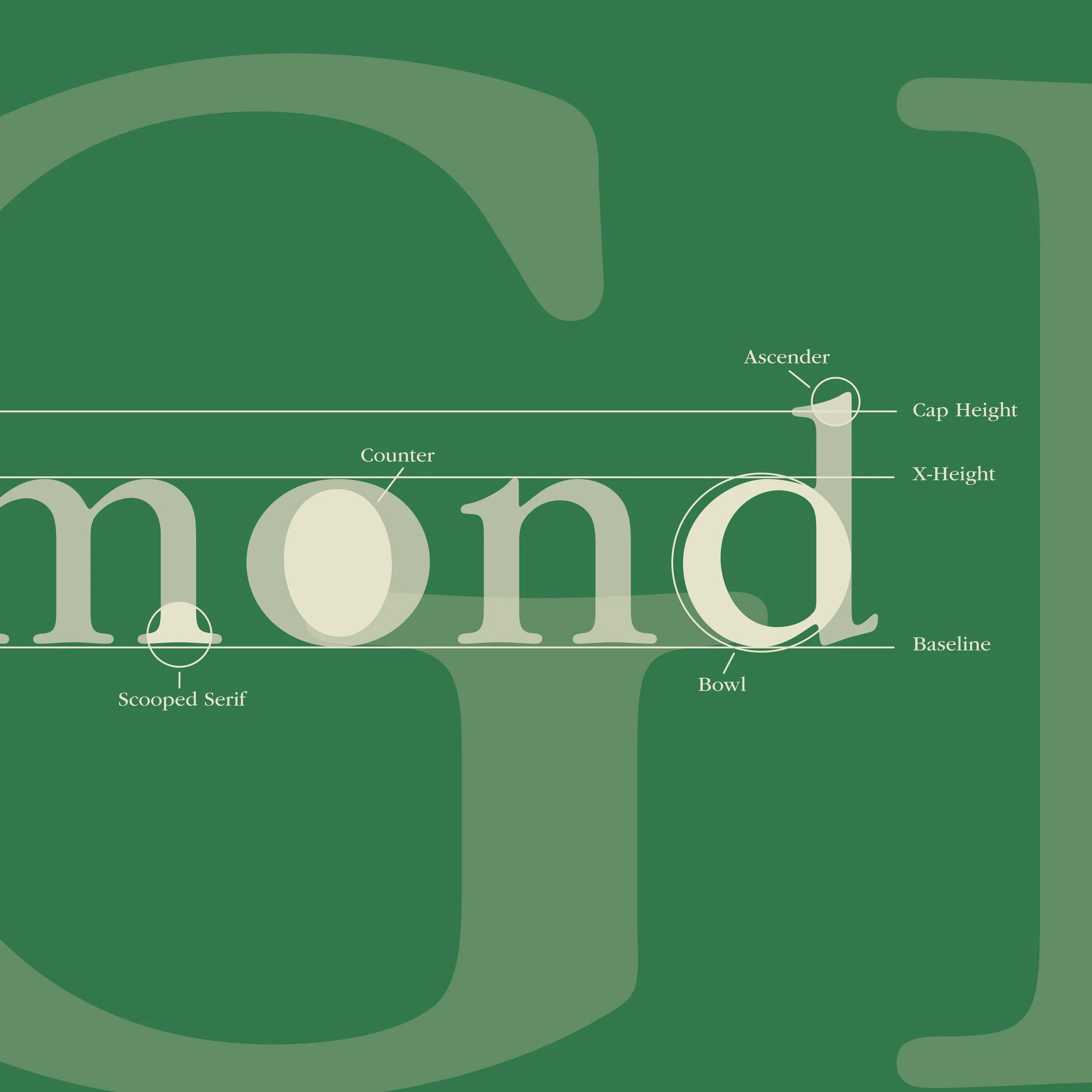
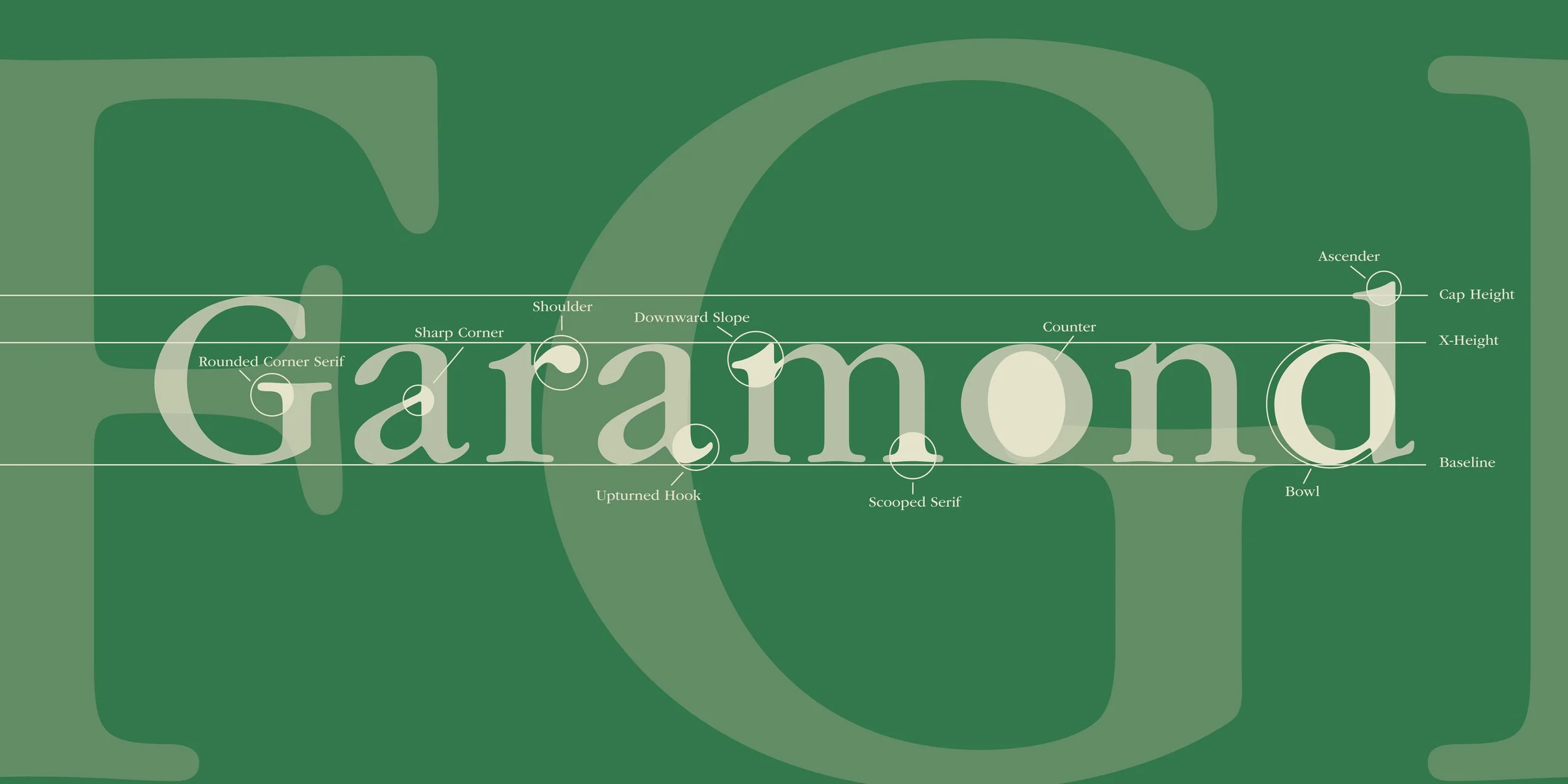
Showcasing typographic anatomy through labeled character analysis
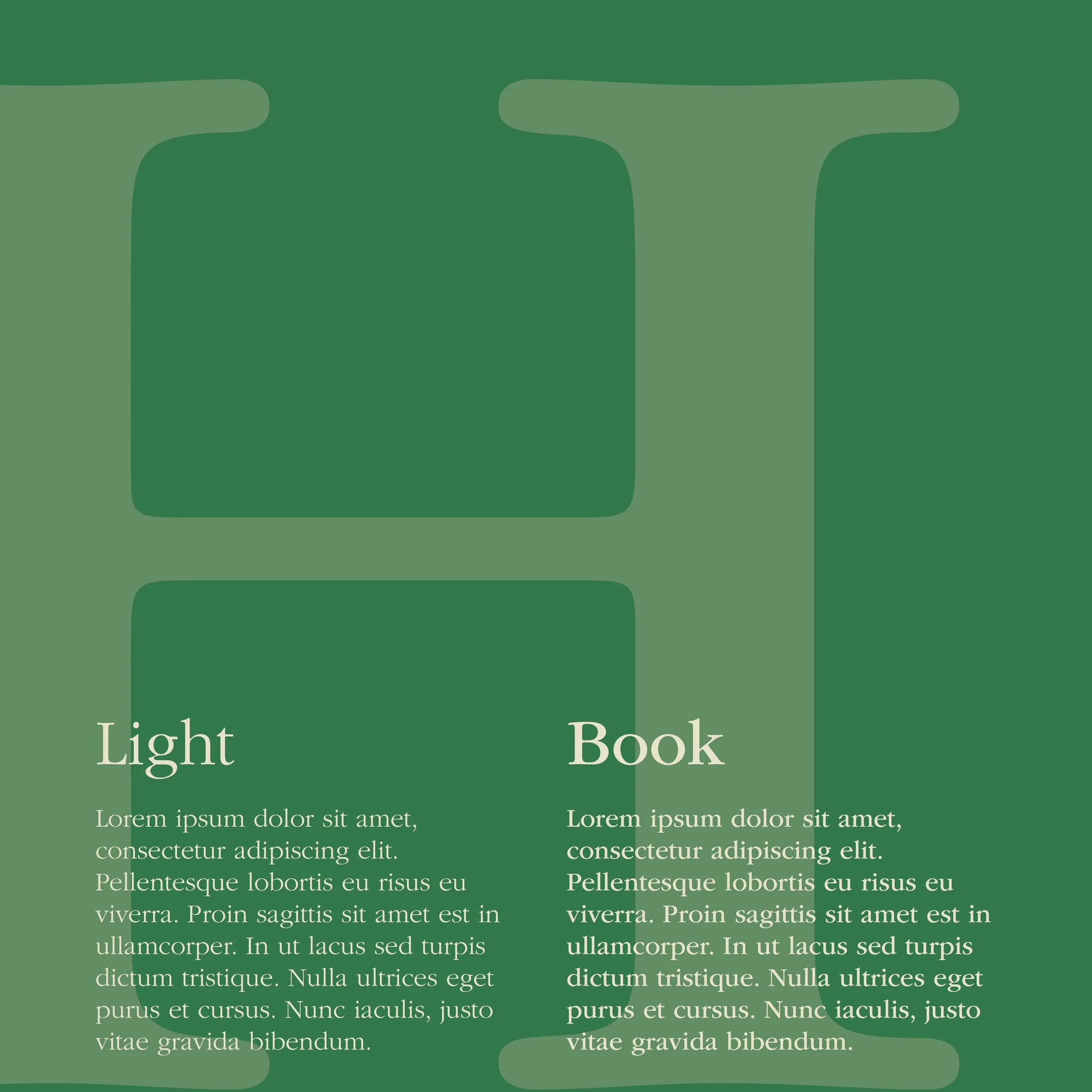
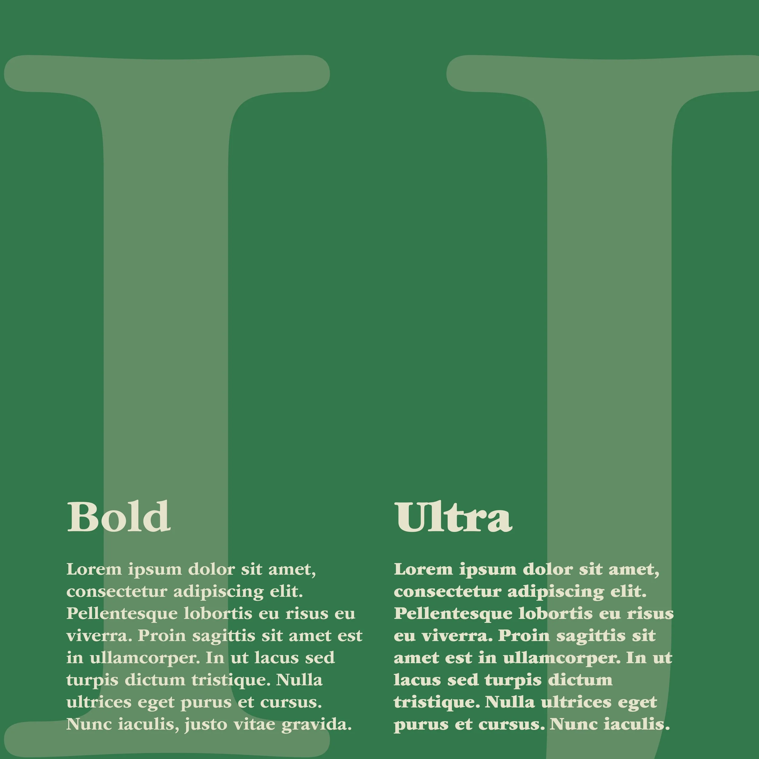
Demonstrating Garamond’s range through multiple weights and styles
Exploring hierarchy, scale, and negative space through editorial spreads
Designing a cohesive visual system that reflected the classic yet enduring nature of old-style serif typography
DELIVERABLES
Multi-page printed type specimen booklet
Cover design and title spread
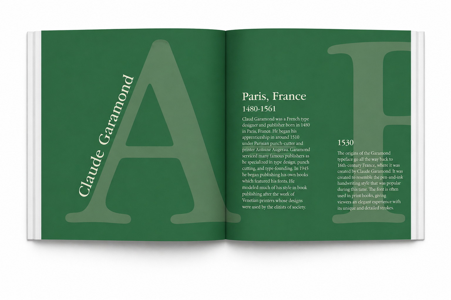
Historical overview of Claude Garamond
Alphabet and character set spreads
Typographic anatomy breakdown spread
Typeface weight/style comparison pages
Usage and cultural relevance spread
Process book documenting inspiration, comps, color studies, and iteration stages
OUTCOME
The final design successfully evolved from early concept experimentation into a cohesive editorial system that visually reflected Garamond’s refined identity. Through the transition from grayscale and orange-toned comps to the final green palette, the project gained a more sophisticated and historically resonant tone. Large-scale transparent letterforms became a recurring structural motif, creating consistency across spreads while reinforcing the typeface itself as both subject matter and design element.
Specific design decisions strengthened the booklet’s effectiveness:
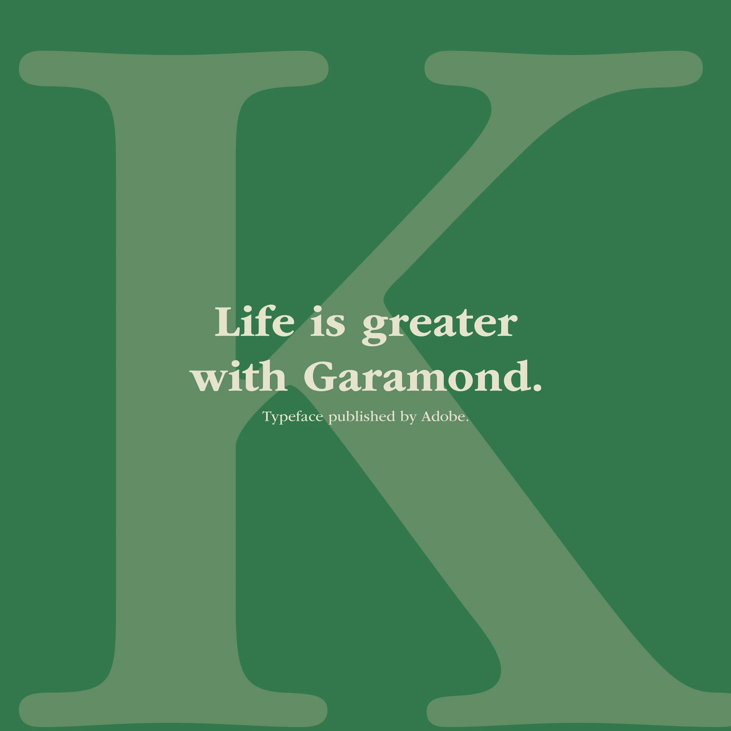
Oversized background letterforms created depth and reinforced brand recognition
Deep green and muted cream palette referenced tradition, elegance, and academic publishing
Thin rule lines and grid divisions added structure without overpowering content
Rotated text elements introduced movement while maintaining editorial sophistication
Anatomy diagrams clearly educated viewers on Garamond’s unique features, such as bowl, serif, ascender, and x-height
Spread sequencing moved from introduction → history → character set → anatomy → application, creating a strong narrative flow
This project strengthened my ability to merge typography, content strategy, and editorial storytelling into a single cohesive design system.
-

DEFINE
Identify how to visually communicate Garamond’s historical importance and formal elegance while educating readers on its structure and use.
-

IDEATE
Explore multiple compositional systems, color palettes, and typographic treatments through iterative comps, including minimal grayscale, warm editorial palettes, and dramatic dark layouts.
-

PROTOTYPE
Develop several booklet spreads in InDesign experimenting with grid systems, scale shifts, overlay techniques, and typographic hierarchy before refining the strongest visual direction.
-

TEST
Evaluate readability, visual consistency, and historical tone across spreads, refining layouts to ensure the final booklet balanced information with expressive design.
Process & Strategy
RESEARCH & INSPIRATION
I began the project by researching type specimen booklets, editorial layouts, and experimental typography compositions to understand how type could function as both content and design. Using Pinterest and other visual references, I explored layouts that emphasized oversized letterforms, strong hierarchy, and dynamic use of negative space. This research helped shape the booklet’s focus on making Garamond itself a central visual element.

Comp 1

Comp 2
Comp 3

CONCEPT DEVELOPMENT
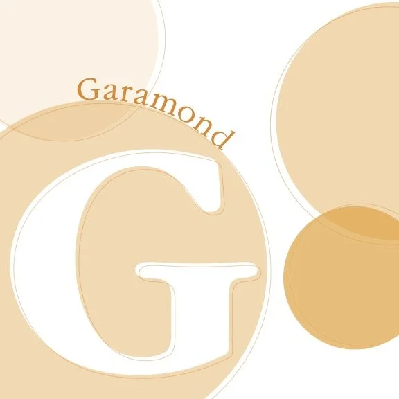
Through multiple composition studies and color explorations, I tested different visual directions for the booklet. Early grayscale layouts helped establish structure and hierarchy, while later color studies explored warmer tones before evolving into the final deep green and cream palette. This final color system better reflected Garamond’s timeless sophistication and historical roots.

LAYOUT & PROTOTYPING
Using Adobe InDesign, I developed multiple spread designs that experimented with grid systems, page sequencing, and visual rhythm. Oversized translucent letterforms became a key design feature, serving as both background structure and typographic emphasis. Thin rules, rotated text, and layered compositions were used to create a refined editorial system.
CONTENT STRATEGY
The booklet was designed to balance expressive visuals with educational value. Historical spreads introduced Claude Garamond and the typeface’s origins, while anatomy pages broke down key typographic features such as serifs, bowls, and x-height. Additional spreads showcased character sets, weights, and real-world applications to demonstrate the font’s versatility.
REFINEMENT
Through iterative revisions, I refined hierarchy, alignment, and pacing to ensure each spread felt cohesive and readable. The final booklet successfully combined historical research, technical analysis, and editorial design into a unified publication that visually reflected Garamond’s elegance while showcasing my skills in typography, layout, and publication design.
Reflection
Designing this type specimen booklet expanded my understanding of typography as both a communication tool and a visual system. Beyond researching Garamond’s history, I learned how editorial structure, hierarchy, and composition can transform typographic information into an immersive narrative experience. This project strengthened my skills in InDesign, grid systems, and publication design while reinforcing the importance of iteration in creating conceptually strong design solutions.